Sundance
Film Festival
Rebrand
Ushering in a new identity for a new era for the Godfather of independent festivals. We partnered with the geniuses at Porto Rocha to make it all happen.
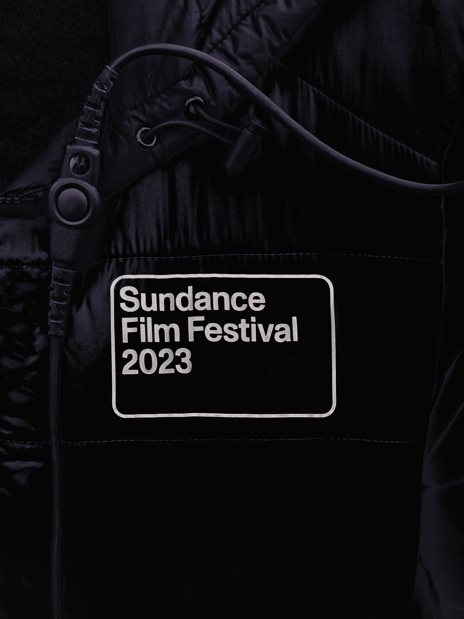
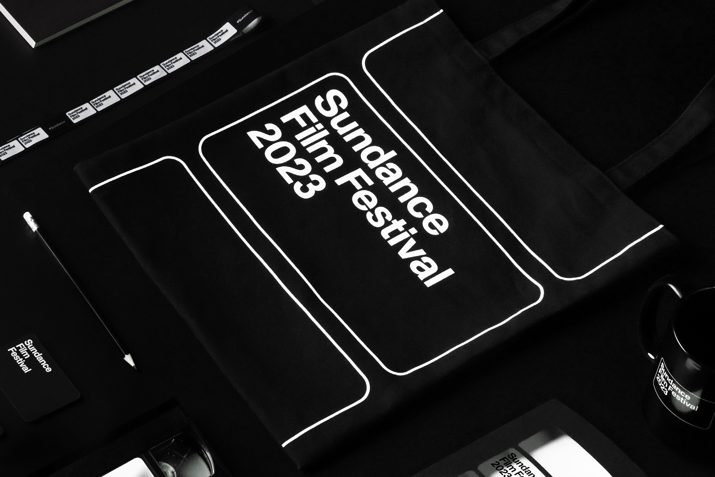
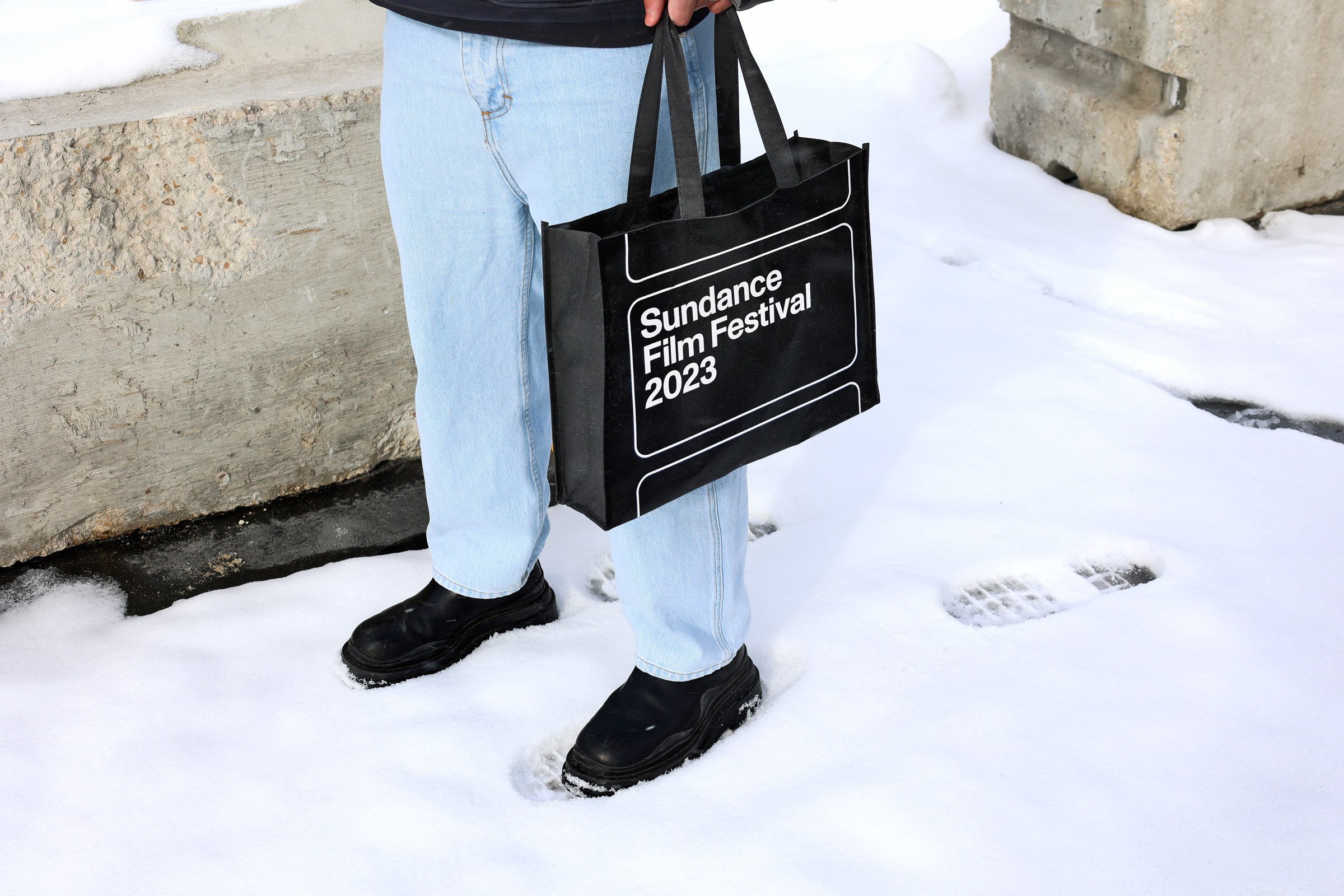
The Logo
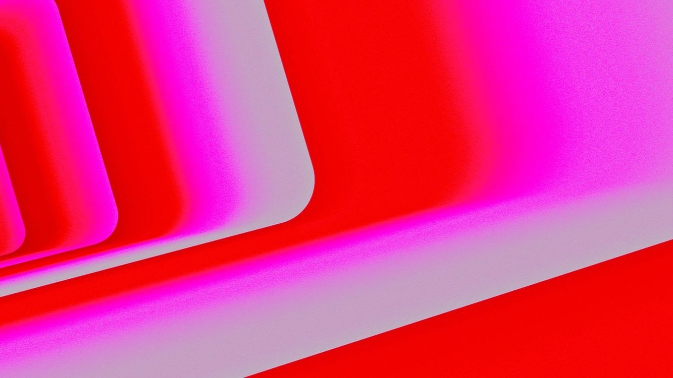
The Sundance Film Festival is designed to provide an international stage for artists to showcase their independent work. The logo, defined by a film-inspired aspect ratio, is both an identifier for the brand and a framing device.
When overlaid on footage and stills from the Festival program and archive, it calls attention to specific moments, characters, and emotions.
The aspect ratio shifts and grows to reflect that shared stage ethos.
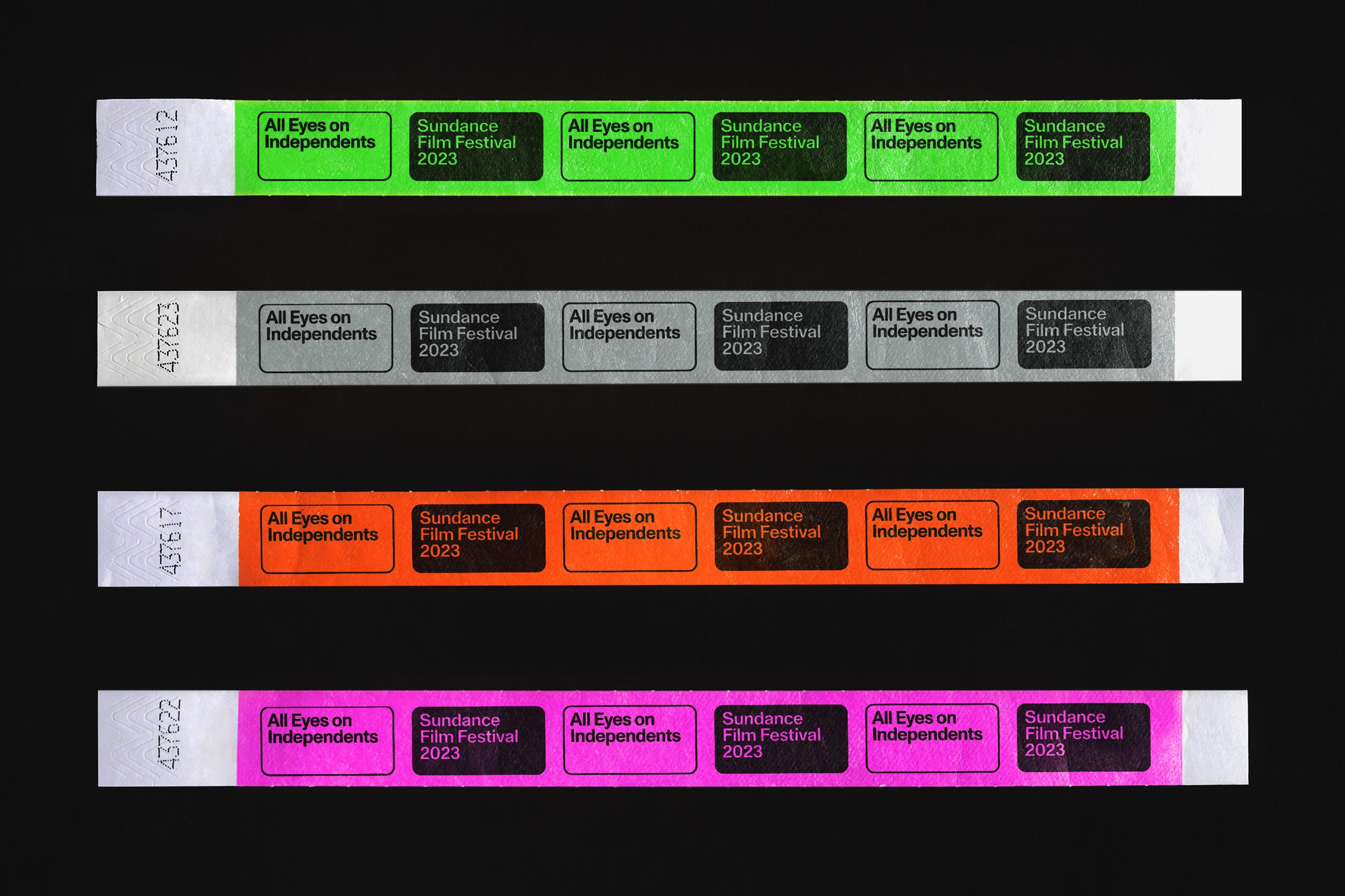
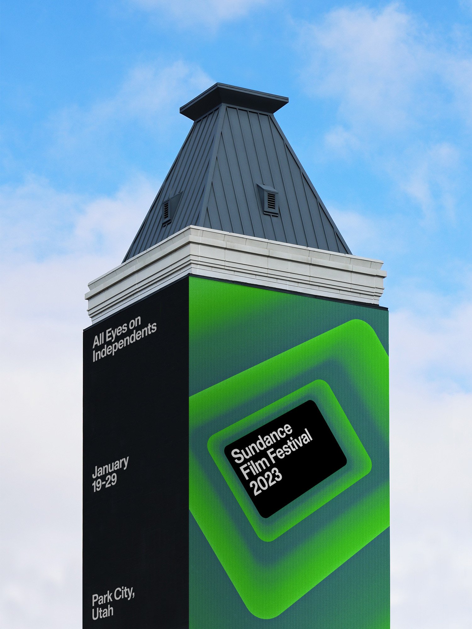
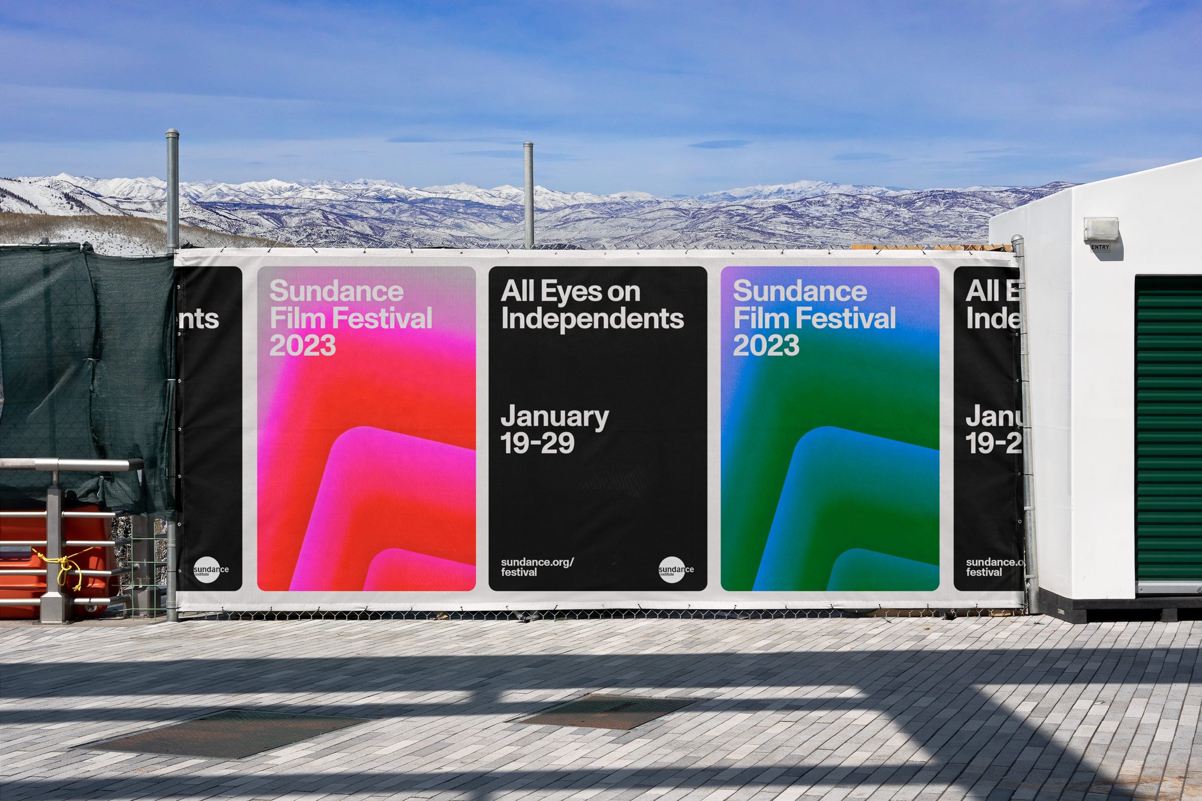
All eyes on
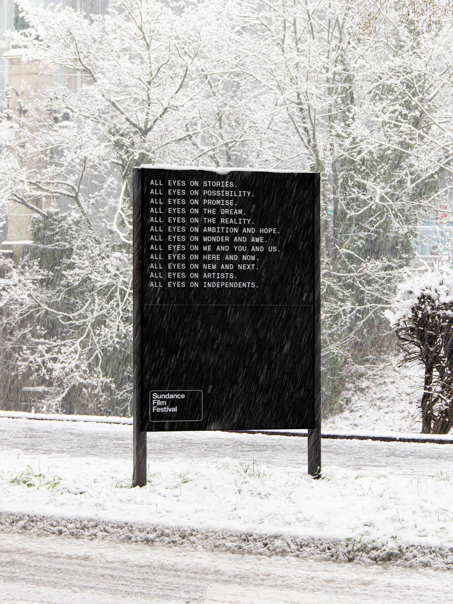
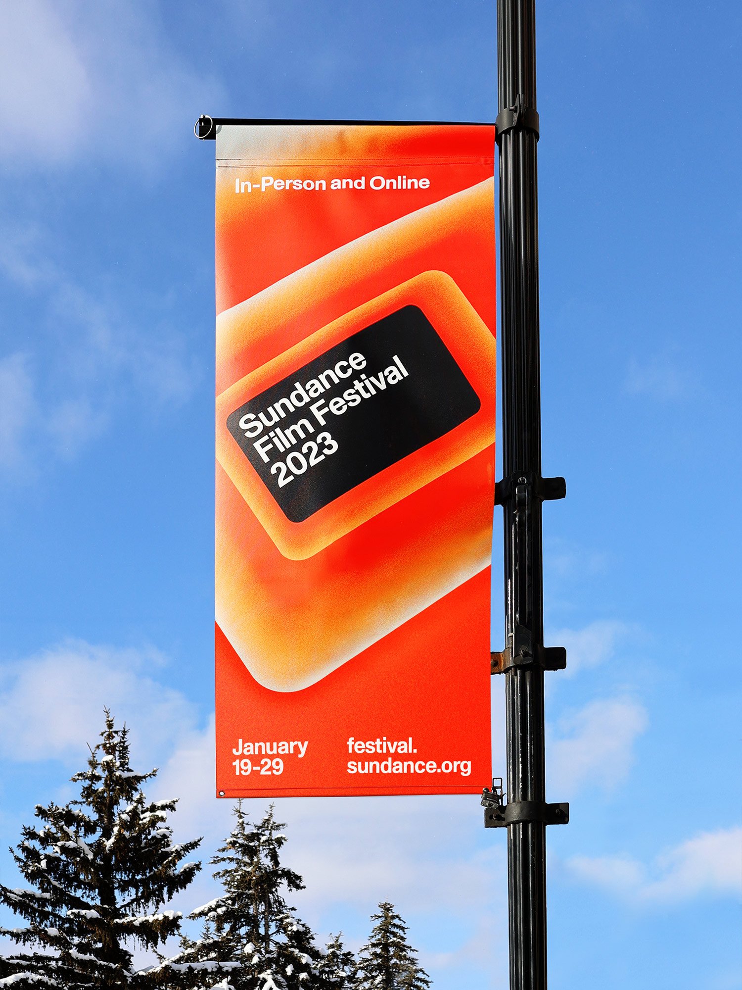
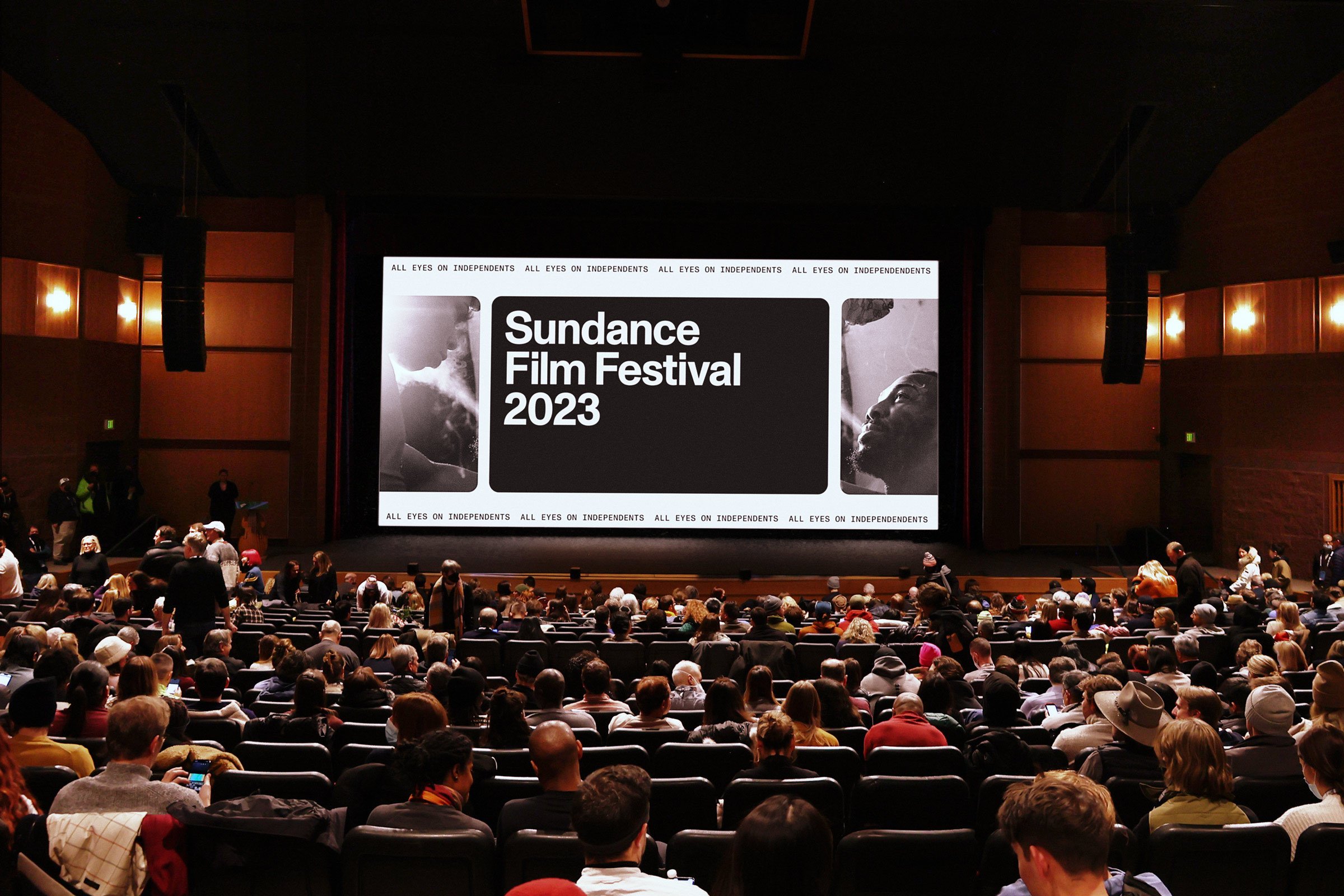
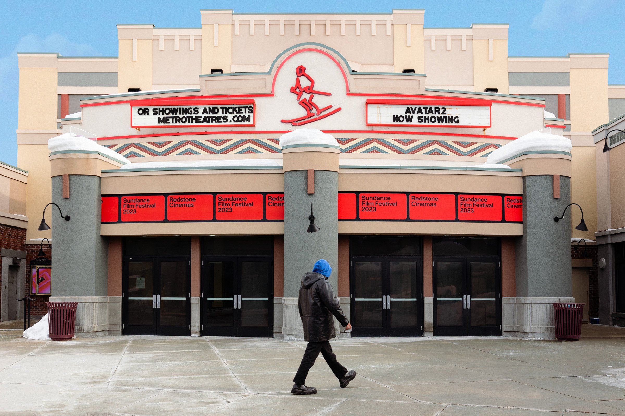
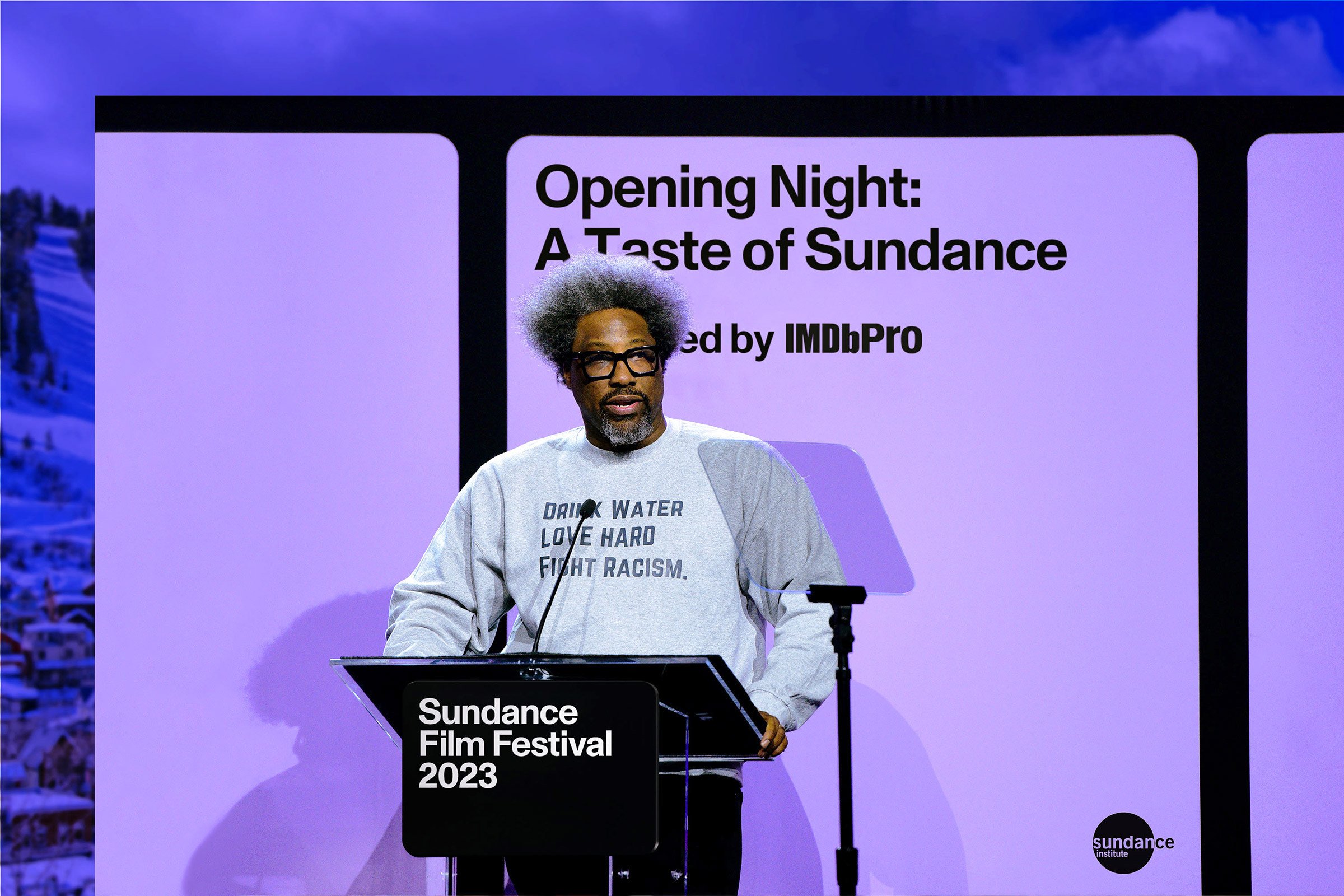
In 2023 we were making a triumphant return to an in-person festival. The eyes of the world were going to be on us, hungry to meet the next generation of independent filmmakers. We embraced that idea and made it our mantra. And we created our cinema tunnels to guide their eyes to the future.
telling
stories
about
film
Compositions take inspiration from the seriality of film strip cells, referencing the shape of the logo to tell stories of their own; and anchored in the language of filmmaking, motion behaviors seamlessly support footage and guide audiences through the brand universe.
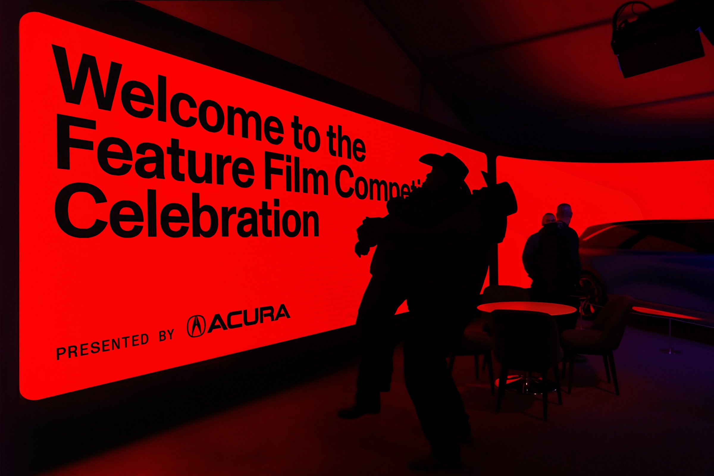
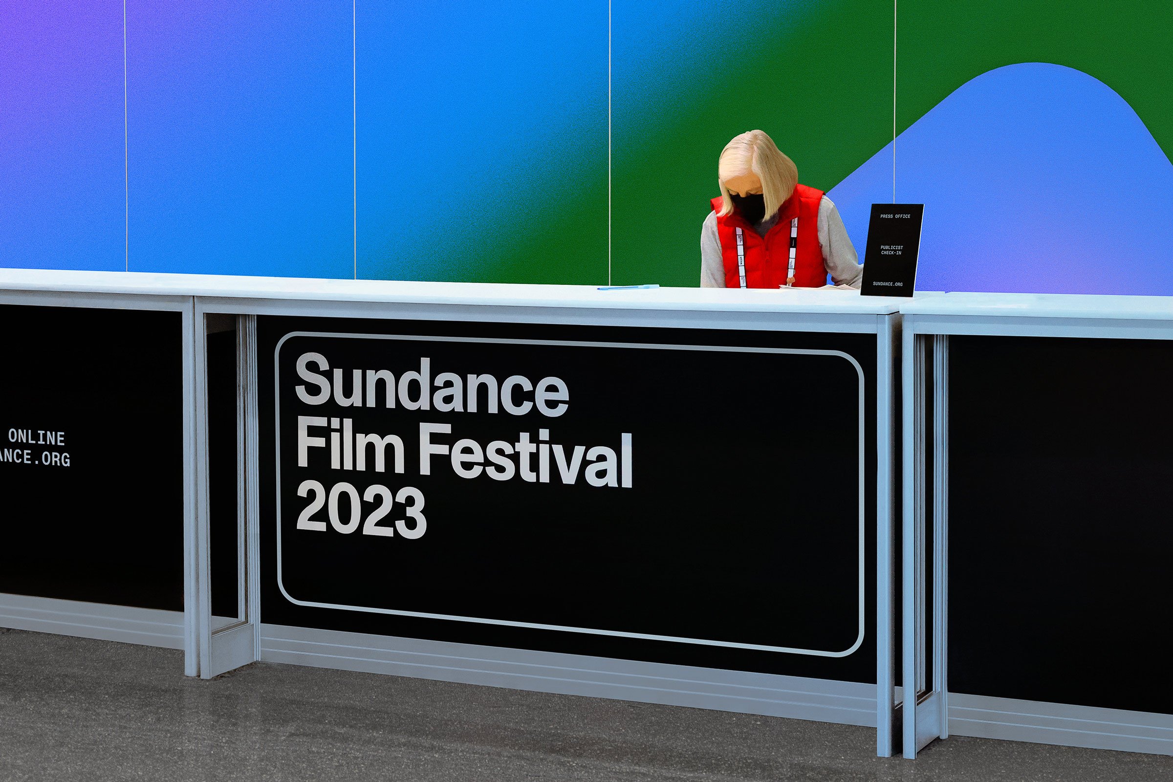
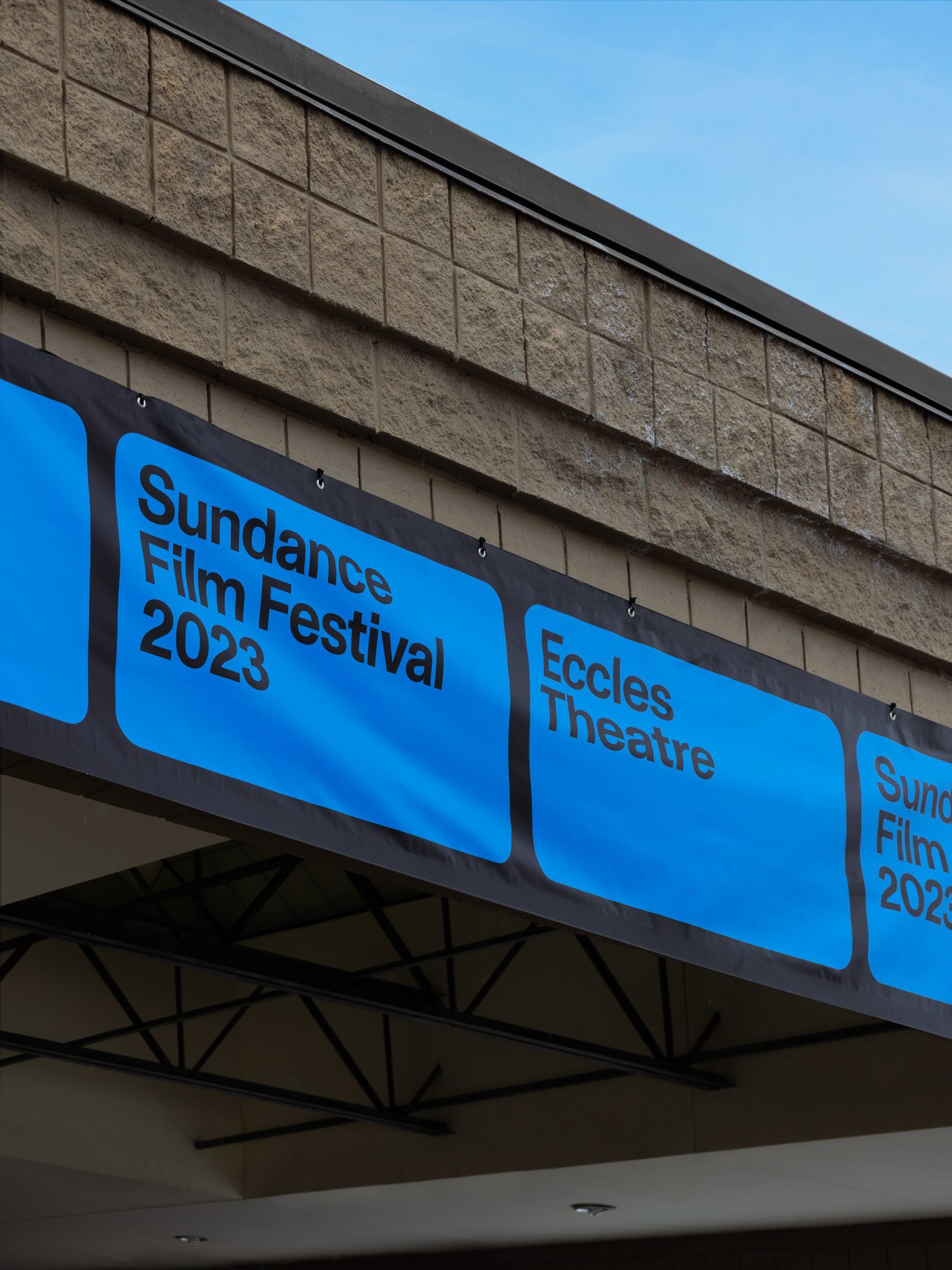
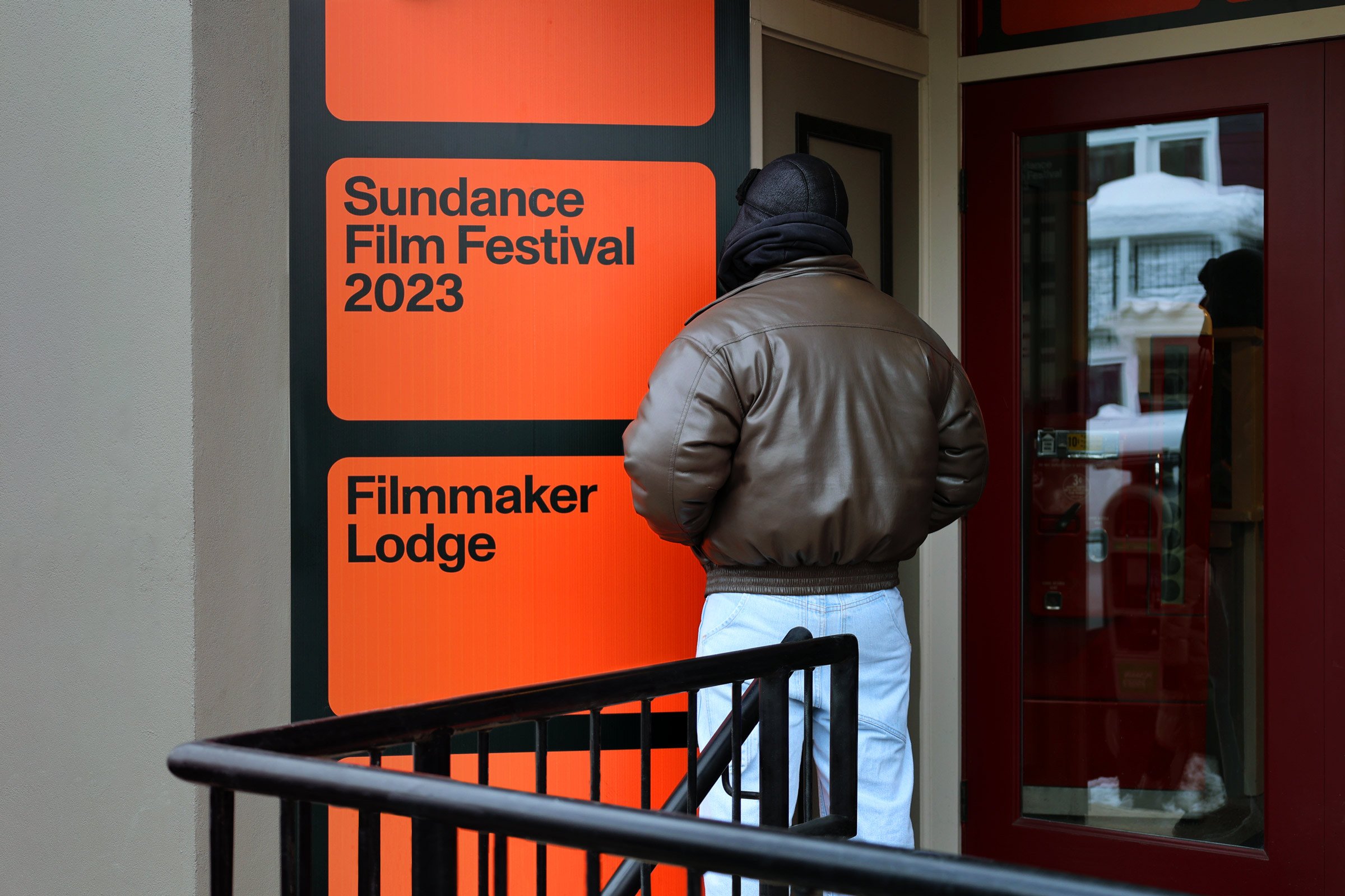
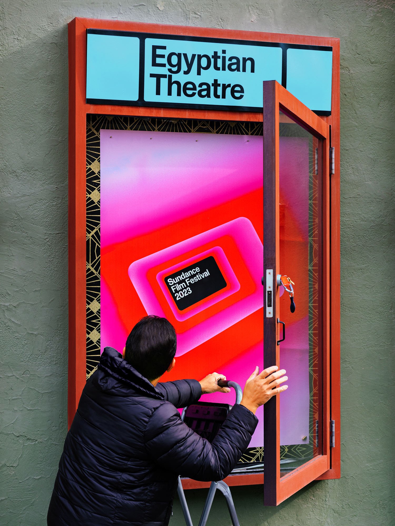
making it real


client
The Sundance Institute/
Sundance Film Festival